
Mister Twister is a new QSR brand from Lucknow serving up pizzas, burgers, and more—with a delicious twist. Moggly crafted its identity from scratch: bold, youthful, and full of flavor. From logo to packaging, every detail was designed to feel fun, expressive, and irresistibly shareable.
Moggly X Mister Twister Partnership
Moggly X Mister Twister Partnership
Our partnership with Mister Twister began at zero—with just a name and a bold ambition. We stepped in to craft the brand’s entire visual world: identity, storytelling, packaging, and everything in between.
THInk
The Challenge
The Indian QSR market is packed. New brands launch every other month, and most end up looking like slightly tweaked versions of each other. Mister Twister didn’t want to be one of them.
The founders came to us with a simple brief: “The food is fun. The name is cool. Let’s make the brand unforgettable.” That meant designing a visual language that didn’t just look different - but felt exciting, energetic, and absolutely snackable.
We had one shot to build a brand people would remember and come back to. The name had potential. It just needed the right story, visuals, and vibe to bring it to life.


Our Approach
Twist as the brand’s superpower.
We built the brand around one powerful idea: the twist.
Twist wasn’t just a word in the name. It was the core of the product experience. From gooey cheese pulls to spiral fries, from wild flavor combos to quirky names, we translated that sense of twist into every design touchpoint.
We focused on creating a personality-led identity system that could grow across packaging, signage, menus, social media, and beyond.

The identity
Our Thinking
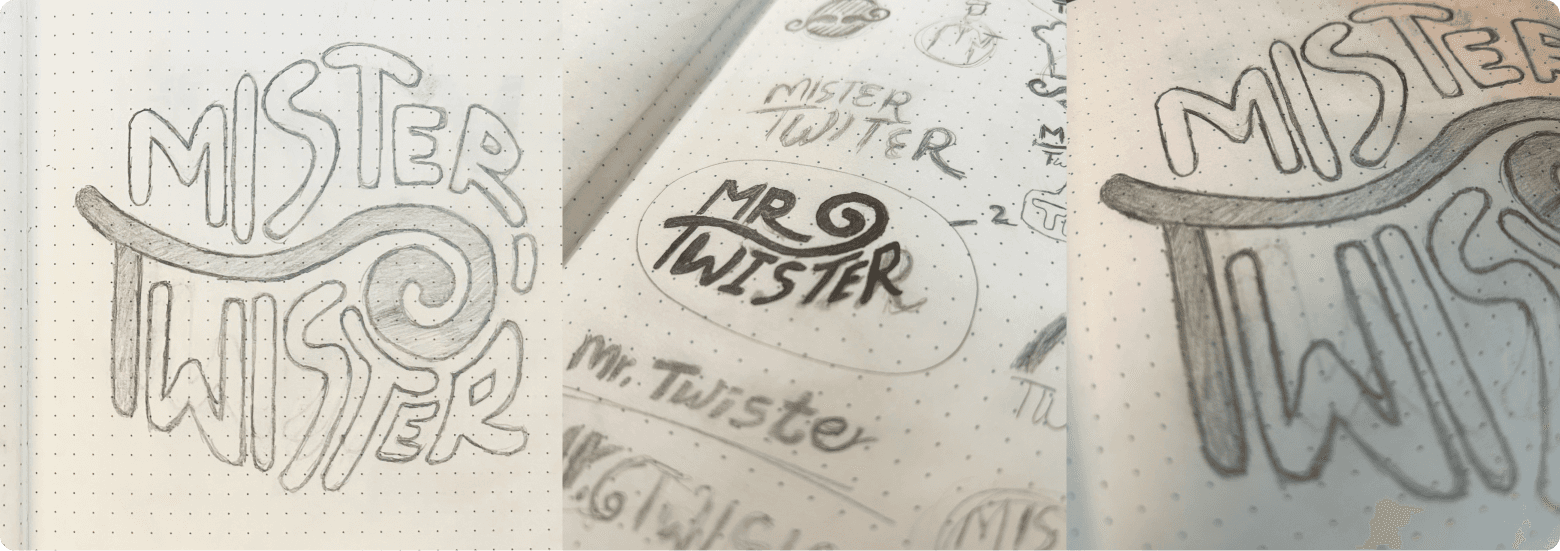
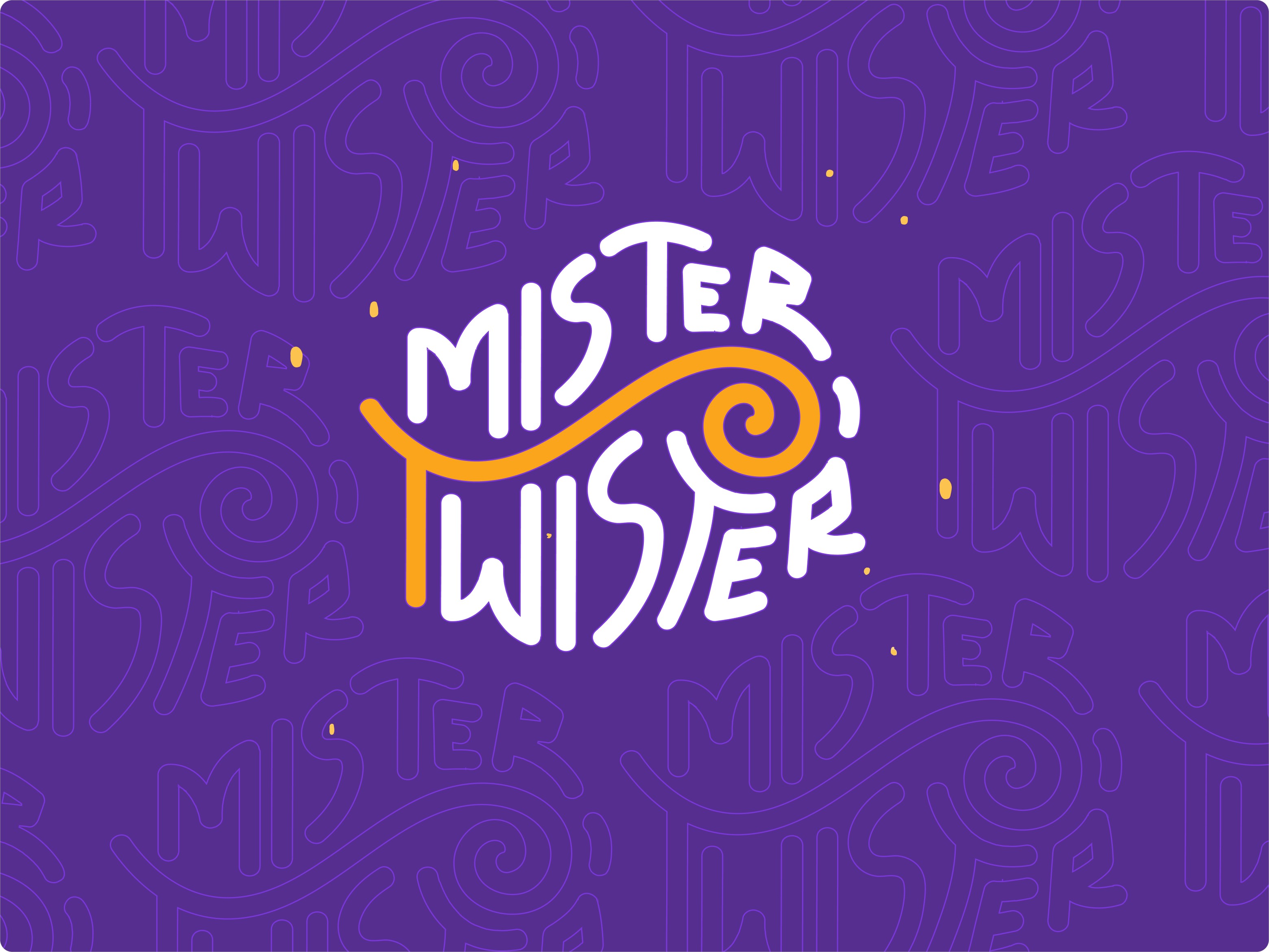
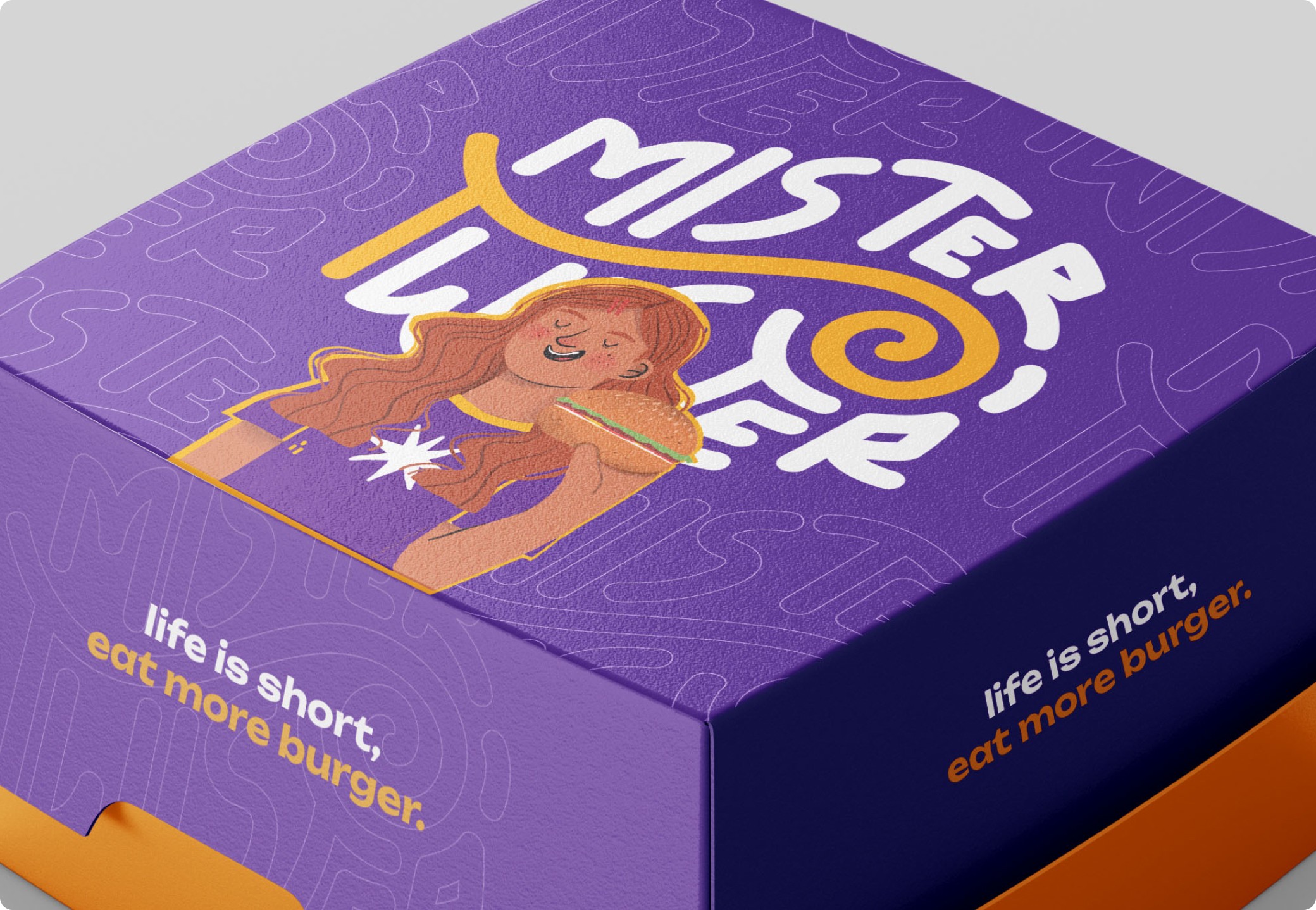
At the heart of the logo is a swirl hidden inside the “T” of Twister—a subtle nod to the motion, flavor, and fun baked into the brand. The custom logotype is expressive and bouncy, playing up the personality without losing readability.
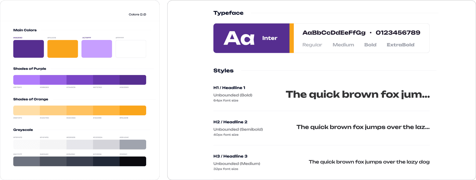
The color palette mixes electric purples and tangy oranges—breaking away from the clichéd reds and yellows of fast food chains. Typography choices lean modern, round, and full of character. The entire visual system feels vibrant, youthful, and hard to ignore.
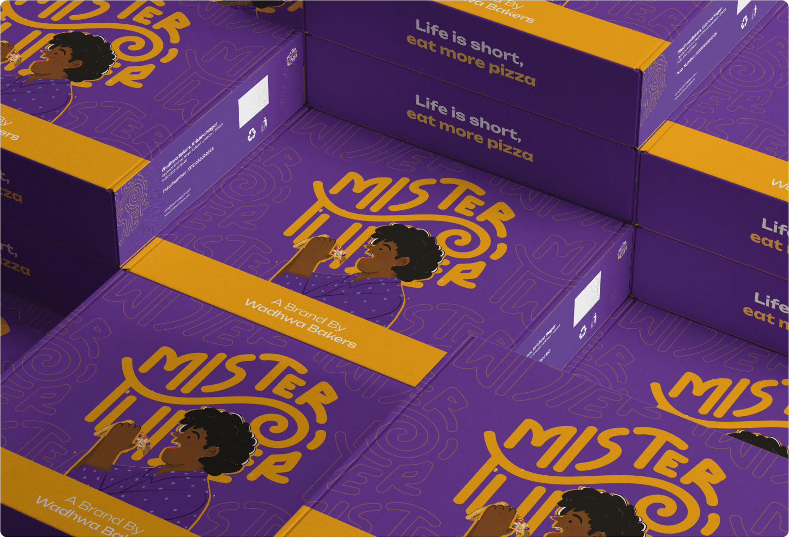
The packaging design doubled as a branding engine. Every box, wrap, and cup was created to be photo-worthy and instantly recognizable.


The impact

